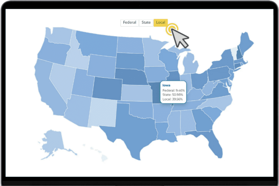
Explore how public school funding sources vary across the country. Understanding where K–12 education funding comes from can help you spot market differences, uncover regional patterns, and make more informed decisions about where and how to engage education leaders.
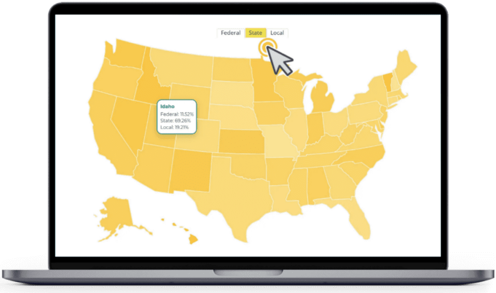
Agile’s interactive funding map gives you a state-by-state view of how public K–12 funding is composed across federal, state, and local sources.
Ready to dive in? Complete the form to start exploring our interactive map today!
K–12 funding models are not one-size-fits-all. Some states rely more heavily on local contributions, while others draw a larger share from state or federal sources. Those differences can shape district priorities, planning conversations, and the context behind purchasing decisions.
Use the map to quickly:
When you can see how funding sources vary, you can better understand the environments education leaders are navigating.

Ready to explore the data? Fill out the form to unlock the interactive map and view public school funding composition by state. Whether you are planning outreach, refining market priorities, or looking for new ways to contextualize district needs, this visual gives your team a clearer starting point.
Use these funding insights to sharpen go-to-market strategies and better align your outreach with the fiscal realities shaping K–12 decision-making. Access the latest education market intel in our interactive funding map.
We use cookies to ensure you get the best experience on our website. Learn more.
We’re here ready to answer your questions! Share a little information with us below and one of our Agile experts will be in touch shortly.